


I’ve been designing websites for years, but I still run across things that baffle me, particularly when it comes to programming sites cross-platform.
Take for instance a bug in WebKit, which powers browsers such as Apple’s Safari and OmniWeb that I discovered while designing the current template for Beckism.com. The short version is that if a background image is attached to a child div but is wider than the parent div (in pixels) it will wrap around into the parent div. Want the longer version? Read on.
In designing the new Beckism.com site them, I wanted to maintain my old look (green header that wrapped around into a right sidebar that stretched all the way down the page) while fixing a number of cross-browser display bugs and general friendliness issues. The main problem is that it is very difficult to stretch a sidebar div to match the height of the main content div. My original solution was to have a fixed pixel width sidebar, and then use a background image attached to the main wrapper div to color it all the way down.
This was an unacceptable solution for the redesign for one reason: I didn’t want a fixed pixel width sidebar. Since designing the new Idol Bat theme, with its em-based widths and ability to scale (hover over the top right tab to get flash controls, including scaling controls), I’ve decided that, where possible, flexible em-widths are definitely the way to go. They scale fantastically well, the text at any size is situated in about the same place, and they just feel cleaner.
The trouble is that an em-width could be any number of different pixel widths based on a viewer’s preferences. Although much more friendly for the end-user, they are hell from the standpoint of graphic design. Sadly, after messing around with any number of solutions, it seemed that the image background was the only viable, cross-browser solution.
So I figured why not just use a background image that’s needlessly wide? This would allow me to have variable width sidebars while leveraging the same workaround as the first version.
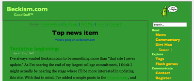
So I whipped out an image that was 1 pixel by 1000 pixels and tried it out. Worked perfectly for every browser except for Safari, which looked something like this:
With a little experimenting, I discovered that in WebKit, if a background image of a child div has a pixel width that is wider than the pixel width of the wrapping div, it wraps around. This is very strange, and threw a bit of a kink in my plans. The WebKit bug meant that I was not only constrained by one variable width, but by two. Grah!
My compromise, for lack of a better solution, was to use an image background that was wide enough that it was unlikely the sidebar would ever grow that big (unless a user has an exceptionally high-resolution monitor) but not wide enough that it was likely to exceed the total width of the main div (ended up being 500 pixels).
Now I can only hope that no one runs into problems; it’s highly unlikely, of course, but I’m still cursing CSS and the browsers for not providing any sort of reliable height controls.
you can try to add the following css property :
background-size:1000px 100%;
(100% value in case of repeat-y background)
let me know, if it is ok with that trick
Posted 3:57 AM on Jun. 24, 2010 ↑
Thank you for this post.
After years the safari webkit browser on iphone4 has the same problem.
Solved with your solution. Yeah.
Posted 4:59 AM on Nov. 7, 2012 ↑