Microsoft Office 2008 impressions

After a seemingly interminable wait, my copy of Microsoft Office 2008 arrived without warning a few days ago. I was mildly excited (after all, I’d heard really good things about the interface improvements, and I love playing with new software).

Then I installed it. While I have to admit that the interface is somewhat improved (at least in Word; I haven’t used the others as much), there’s one little problem that the reviews I read failed to mention:

At its core, Office 2008 isn’t more Mac-like. It’s more Vista-like. This is perhaps a subtle difference, thanks to the fact that many of Vista’s improvements are inspired by Mac OS X.

I have, admittedly, only used Vista briefly, but from those brief encounters, it seemed to me that Vista introduced a number of nifty visual effects that increased the system requirements without serving any functional purpose.

This is one of the big differences between Apple and Microsoft’s approach to interface design. Apple’s Aqua interface has a number of cool visual effects (Exposé being one of the most obvious). In general, Apple designed said effects to reinforce the way the operating system works. Exposé’s swooping windows immediately communicate what is happening to the user without any need for textual explanation. Even Time Machine’s over-the-top space animations effectively tell the user what the program is doing.

(The only obviously superfluous effect I can think of off the top of my head is the ripple effect in Dashboard when you add a new widget. Whenever I need to remind myself that Apple isn’t perfect, I add a few new widgets to Dashboard. Ludicrous.)

Designing Vista, Microsoft seems to have asked themselves why OS X is doing so well and then decided that it was because of the interface’s bubbly appeal to the user. They then proceeded to implement a number of visual effects in Vista, including highly transparent windows, glowing buttons, and “Flip 3D” tab switching.

These visual effects do make Vista more appealing (translucent windows in particular are pretty cool). However, they also incur a hefty hit to the system requirements, and most of them, to be perfectly frank, are superfluous. In point of fact, if you don’t have a good enough graphics card or just don’t like the eye candy, you can turn Vista’s visual effects off.

The fancy transparent windows and so forth of Vista are unnecessary, and Microsoft designed them knowing they served no functional purpose (otherwise they wouldn’t be optional). They’re like cheap frosting on a homemade cake. All they add is a few pounds to your waistline, and cake would have been just as tasty without them.

When Apple designs a visual effect, they don’t let you turn it off. Expos´’s eye candy isn’t optional because it is an integral part of Expos&eacute’s function. Apple undoubtedly went through a number of different implementations for Expos&eactue and chose the one we know and love because it was a great marriage of form and function.

Both Apple and Microsoft invest time and effort into carefully designing appealing visual effects, but Apple takes care to remember that unless the visual effect has a purpose, you’re probably better off freeing up some of the computer’s memory.

Which leads me to Microsoft Office 2008. One of the first things I noticed when I launched Word 2008 (aside from the fact that it took almost as long to launch as Word 2004 did; ouch) was a superfluous visual effect. Specifically, the rippling button mouseovers down in the lower left corner. See for yourself:

[ Javascript required to view QuickTime movie, please turn it on and refresh this page ]

This is Vista-style design at its best:

  • If you took the ripple effect away, the user would be unaffected
  • The ripple effect doesn’t reflect what is going on (a ripple on a pond happens when something comes into contact with the pond, not when something hovers near the pond)
  • The ripple effect (and others like it) are contributing to Word gulping down memory and performing like a sluggish juggernaut despite being a Universal application

Granted, this is a single, small detail, but it’s representative of the overall approach to Office 2008’s design. Microsoft’s Mac Business Unit has tried to make Office a better Mac citizen by imitating Apple design patterns without taking the time to understand either Apple’s method or design logic.

Rippling buttons may be a harmless example of the results of imitating Apple interface design without understanding the underlying logic (disregarding for the moment the performance hit caused by lots of little interface embellishments adding up), but the Word preferences window shows how design without logic can make using the software difficult. Word 2008’s preferences have been considerably changed from 2004 and now resemble a standard Mac program preferences screen:

Word 2008's new preferences window

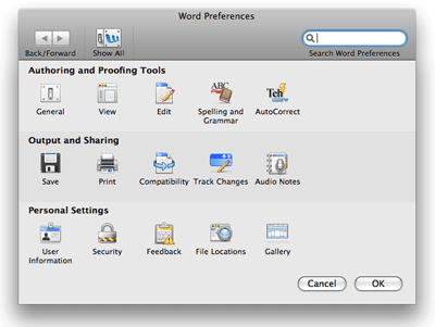
On the surface, definitely an improvement. The problem is in the details: two of those preference buttons are document-specific preferences. They aren’t even separated out, but are rather intermingled in with the program-wide preferences (the two in question are Security and Compatibility). The preferences window may look similar to other Mac preference windows, but the underlying design logic that governs Apple products simply isn’t there, making the entire thing confusing and difficult to use.

Although I haven’t yet explored PowerPoint, Excel, and Entourage in detail, my initial cursory use of them hasn’t done anything to change my opinions about the general design ethic throughout Office 2008. To be honest, I’m really disappointed. I was hoping that when reviews said Office 2008 was more Mac-like it meant that Microsoft applied some Apple design logic to improve the user experience instead of making changes based on Apple’s superficial interface.

On a more positive note, Office 2008 is an improvement over Office 2004. Once things are running, the programs are a little bit more responsive, and some of the notable downsides to the program don’t affect me (I never used the VBA scripting language, for instance). Given that I paid practically nothing for the upgrade thanks to the “super suite” deal, I can enjoy the positives without worrying about the negatives. I don’t regret upgrading to Office 2008, but I’m disappointed at the many missed opportunities in the program.

Overall my relationship with Office is unchanged. I only ever used Office 2004 when I had to (mainly so I could be guaranteed of compatibility with clients), and there is nothing in Office 2008 that would encourage me to use the software voluntarily instead of turning to Nisus Writer Pro or the iWork suite.

I hope that one day Microsoft will realize that what makes Apple products attractive isn’t the lickable interface, but the design ethic that underlies all of their decisions. For now, though, upgrading to Office 2008 is like upgrading from Windows XP to Vista; prettier, but with the same intrinsic flaws.

The Absolutely True Diary of a Part-Time Indian by Sherman Alexie

The Absolutely True Diary of a Part-Time Indian by Sherman Alexie is one of those beautiful books that captures a small but representative sliver of life. I’m always in awe of books that portray life in all its horrific, capricious, hilarious complexity. I tend to hyperbolize in my writing; Sherman Alexie has managed to mingle a humorous love of life with mind-numbing tragedy in a way that makes me painfully envious.

I highly recommend The Absolutely True Diary of a Part-Time Indian. It’s an excellent read, and the comics interwoven with the text are hilarious.

Fire Bringer by David Clement-Davies

I’ve been meaning to read Fire Bringer by David Clement-Davies for years but kept forgetting to buy it. I finally stumbled across it in Barnes and Noble the other day, though, and gave it a read.

It was a mixed bag. Fire Bringer was a fun read, but it didn’t tread any new ground. It’s very similar to Watership Down, both in anthropomorphic animals and content (deer in unholy contracts with humans, etc.), with a little Nazi fascism mixed in for good measure. A decent book, but one that I probably won’t reread in the near future.

How to install Chyrp

Chyrp‘s installation instructions are worthless, and the installation script’s errors even worse. If you’re trying to install Chyrp and getting “Could not modify database settings file” errors, make sure that you’ve followed all of these steps:

  • If you don’t already have a database ready for Chyrp, set one up and make sure you have the details on hand (host/database/user/password).
  • Unzip the package and upload the files to the desired location on your server.
  • In your FTP program, open up the includes folder and change the files named config.yaml.stock and database.yaml.stock to config.yaml.php and database.yaml.php respectively. Set both files’ access permissions to 777 (read/write/execute for everyone).
  • You may also need to rename chyrp.htaccess to .htaccess and give it 777 permissions, as well. There were conflicting reports online, and I did it just in case.
  • Navigate to Chyrp’s install.php script in your browser, and follow the instructions. This will probably be somewhere like http://yourserver.com/chyrp/install.php.
  • Delete the install.php file with your FTP client once you’ve finished.

That should get Chyrp up and running! Hopefully one of these days there will be some useful installation instructions included with the download. For such an easy process, it sure was difficult to figure out.

Update: I had an opportunity to install Chyrp again, and you do indeed need to rename .htaccess and make it writable or you’ll get an error about Chyrp not being able to write to the .htaccess file. Please note that these instructions are for Chyrp 1.1.3.2. They may or may not apply to future versions of Chyrp.

The mysterious whining MacBook Pro

I love my MacBook Pro. When they came out, I knew the fifteen inch, top-of-the-line MacBook Pro with an Intel Core Duo was my dream machine, and even though it took me a while to get one, I’ve never looked back. I’d suffered with a 700 pound eMac for so long that I’d forgotten how beautiful a Macintosh can be.

Fast-forward to late 2007 when I’ve graduated from college and somehow managed to acquire an income, an apartment, and a widescreen TV. My TV is also a thing of beauty. Thirty-two inches (which is the perfect size for my living space), 1080p high definition, and a gorgeous shining black surface. It’s a Sharp Aquos 32″ HDTV, and if you’re in the market for a television at that size, I highly recommend it. Beautiful picture, perfect for gaming (which is why I bought it), and the built-in speakers are quite good, as well, which is a major plus because I hate the neighbors thanks to their sound system, and wouldn’t wish to become what I despise.

With two such wonderful gadgets in my house, naturally I wanted them to get together, so I went out and bought an HDMI cable and an audio audio cable to connect the MacBook Pro to the TV. As best I can remember, it worked great the first few times I watched movies.

But the last couple times, as soon as I plugged in the audio cable, the TV started outputting a high-pitched whine through the speakers, which was extremely annoying.

I figured it might be the audio cable, but that didn’t make much sense; it was new and worked fine a few times. Magnetic interference seemed like a long shot, since there was nothing electronic nearby except the TV and the computer itself. Before I rushed off to buy a second audio cable, I decided to consult the internets.

After a little research online, I found there was some info about whining MacBook Pros, but it all had to do with the computer itself whining. Fortunately, Daniel Jalkut had quite a lot to say about CPU whining in MacBook Pros. I tried his QuietMBP program, and surprisingly, it fixed the whine through the television speakers.

Here’s where it gets fun: the QuietMBP program basically uses up idle time in the CPU by running pointless data through it. You can control how often the program runs stuff through the CPU with a slider, and you’re supposed to set the slider as high as you can to alleviate the noise (lower numbers = smaller gaps between CPU usage = more power consumption). I started dragging the slider, and the whine started changing pitch in real time.

Seriously, I could have played music with the damn thing. It was bizarre. Why the heck does a piece of software that’s supposed to help with CPU-related whining change a whine going through external speakers? Why have I never heard a whine through either my computer’s speakers or my trusty JBL Creatures? What god of electronics did I offend, anyway?

It’s baffling to me.

Now that I’m sensitized to the whine, though, I’m realizing that I do sometimes get a strange high-pitched whine when my MacBook Pro is running off battery. Why it took almost two years and a TV to bring this to my attention, I don’t know. Possibly because the eMac was basically a jet engine with a screen on it (think noise, not speed) and my ears have been ringing all this time.

In any case, if you’re experiencing problematic whining when you hook your MacBook Pro up to a pair of external speakers that otherwise behave well, it might not be your cable, your speakers, or really anything involved with getting audio from your Mac to the outside world. It might be your CPU.

Go figure.

OfficeTime updated to 1.3

OfficeTimeMy absolute favorite time tracking software, OfficeTime, was updated today to version 1.3. This version brings a whole bunch of improvements to how OfficeTime interacts with iCal calendars, as well as a number of bug fixes and other good stuff.

OfficeTime is at the same time the simplest and one of the most powerful of the time tracking applications that I’ve tried, and I use it daily. Once I’d tasted OfficeTime’s speedy project switching and quickly generated reports, there was no going back. Every once in a while I try the alternatives thinking that surely one of them will have something on OfficeTime but so far I’ve never even been tempted by the competition. I highly recommend the program to anyone trying to keep track of their time across multiple projects who also needs simple invoicing.

IE 8 using standards by default

Wow. Like others around the web, I am shocked to learn that IE 8 will render pages in standards-compliant mode by default; Microsoft has spoken out and reversed their decision to have IE 8 require a meta tag for standards mode.

This is so mind-boggling that it’s hard for me to process. Microsoft is giving improved web standards priority over backwards compatibility and, more importantly, listening to the developer community (many of whom spoke out vehemently against IE 8’s proposed requirement of a meta tag to operate in standards mode). Thank you, Microsoft. I’m really happy to know that you’re actively working to support web standards, and especially that you’re willing to listen to the community.