Shrek 3: they should have stopped at 2

Went to see Shrek 3 last night (“version originale”, since I’m still in Paris). Whoops. They should have stopped at number two.

This seems to be a theme: Shrek 1, so good. They’re like, “Hell, we can make bank!” and the writers get excited and there you’ve got Shrek 2, surprisingly good. Then the producers are like “WRITE MORE NOW!” and the writers say to one another, “Hey, do you have any ideas?” “No, you?” “Um, what if Donkey and Puss in Boots switched bodies?”

And there’s Shrek 3.

Here’s a hint, for anyone who is writing or producing the third movie in a blockbuster series: if you pound out the script and notice that every conflict is resolved with a heartfelt, cliché-ridden speech…don’t even bother.

Paris, so classy

As of a half week ago or so, I am in Paris, consuming their cultural artifacts like a good American tourist as part of my thank-God-I-graduated activities.

Here’s the thing about Paris: people are always telling you that Parisians have serious class and romance going for them. Of course, the fact that you are liable while walking down the street to step in dog crap flies in the face of this a bit, but evidently they’re working to fix that little faux pas.

But what really makes me think that this whole “we’re classy” thing is just marketing is the pharmacies. It seems like every block has a pharmacy, or sometimes two, and while this would not necessarily be a bad thing (maybe Parisians just get sick a lot), every single pharmacy has a garish green and often blue neon plus sign sticking out into the street, usually flashing, and always really, really ugly.

I don’t get it. Who the heck thought that this would be a good idea? Sure there’s neon in some parts of the city, which is to be expected, but walking down what would otherwise be an interesting street of apartments and little shops who wants a brilliant flashing plus sign in their face?

On the other hand, the newer, snazzier pharmacy signs show you the temperature, and in the absence of your typical American bank sign, that’s kind of nice.

Paid video downloads on the outs

Peter Cohen over at Playlist published an article about some analysts who predict that iTunes-style video downloads will go the way of the dinosaur when movie studios start to offer web-based subscription content with targeted advertisements instead. The report sounds like a kick in the pants, but for some reason the analysts are charging $775 to read it. If only I’d known I could make money by making ridiculous claims! How am I missing out here?

Anyway, I always wonder what these people are thinking. I’m sure the movie studios will lap it up, since they probably would make a lot more money with advertisement supported subscription distribution, but consumers? Not if they’re smart. For one thing, although the DRM is restrictive to the point of worthlessness, at least with an iTunes purchase you own the movie or TV show, completely advertisement-free.

Perhaps this makes more sense for shows that you’ll want to watch once and then never see again (I recently tried ordering the Daily Show through iTunes for a few months, and quit because they were taking up space and weren’t something I’d ever watch again), but movies? Thanks, but I’ll stick to no advertisements and something I can keep for a while.

Applebee’s: mysteriously soggy

Maybe a few months after my girlfriend and I started going out, we wanted to eat out and I suggested we head down to the local Applebees. They’ve got a relatively wide range of food on their menu, and I’ve had some tasty dishes. “No thanks,” she said. “Their food’s all soggy.”

Well, this was perplexing, but whatever. We went out somewhere else.

Eventually, though, I was finally able to convince her that Applebee’s food can’t all be soggy. Surely one or two soggy dishes can’t be enough to put you off a restaurant for all time, I said.

We’ve gone a few times since then (the most recent being last night), and the odd thing is that her food is always soggy. It’s really perplexing. I’ve ordered any number of dishes there and not a one has been soggy. But we go there tonight, she orders a wrap, and when our food gets there picks it up and the whole bottom of it is covered is drippy grossness.

It’s really quite bizarre, and calls out for some empirical testing. Do redheads always get soggy food? Is it just her? If we ordered the same dish, would one be soggy and the other not?

These questions plague my soul.

Regex: oh my

I recently landed a web design client who has a website that needs a little sprucing up, an entirely new admin backend that can be administrated by real people, and a lot of code updating. Its code is hideous; completely non-XHTML compliant with capitalized tags scattered everywhere, some pages are seas of Word-generated HTML (which is the worst nightmare of any decent web designer), and it’s otherwise just pretty hideous.

Fortunately for me, I have a lovely utility called TextSoap Deluxe. TextSoap has any number of ways to clean text, and one of its nicest ones is the ability to create a custom cleaner based off of regex rules, which will then churn through a chunk of text and do things to it. Of course, I knew very little regex at the time, but after a few hours sitting down with the excellent Regular-Expressions.info tutorial and doing a bit of trial and error in TextSoap I was able to create a cleaner that at least simplifies my life by lowercasing the things that need lowercasing (among a few other things). If you use TextSoap and want to see what I’ve done, I’ve posted an early version of the cleaner in the TextSoap forums: XHTML Cleaner for TextSoap.

Webkit background image display bug

I’ve been designing websites for years, but I still run across things that baffle me, particularly when it comes to programming sites cross-platform.

Take for instance a bug in WebKit, which powers browsers such as Apple’s Safari and OmniWeb that I discovered while designing the current template for Beckism.com. The short version is that if a background image is attached to a child div but is wider than the parent div (in pixels) it will wrap around into the parent div. Want the longer version? Read on.

In designing the new Beckism.com site them, I wanted to maintain my old look (green header that wrapped around into a right sidebar that stretched all the way down the page) while fixing a number of cross-browser display bugs and general friendliness issues. The main problem is that it is very difficult to stretch a sidebar div to match the height of the main content div. My original solution was to have a fixed pixel width sidebar, and then use a background image attached to the main wrapper div to color it all the way down.

This was an unacceptable solution for the redesign for one reason: I didn’t want a fixed pixel width sidebar. Since designing the new Idol Bat theme, with its em-based widths and ability to scale (hover over the top right tab to get flash controls, including scaling controls), I’ve decided that, where possible, flexible em-widths are definitely the way to go. They scale fantastically well, the text at any size is situated in about the same place, and they just feel cleaner.

The trouble is that an em-width could be any number of different pixel widths based on a viewer’s preferences. Although much more friendly for the end-user, they are hell from the standpoint of graphic design. Sadly, after messing around with any number of solutions, it seemed that the image background was the only viable, cross-browser solution.

So I figured why not just use a background image that’s needlessly wide? This would allow me to have variable width sidebars while leveraging the same workaround as the first version.

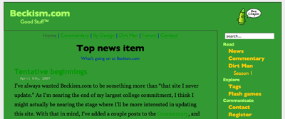
So I whipped out an image that was 1 pixel by 1000 pixels and tried it out. Worked perfectly for every browser except for Safari, which looked something like this:

Sidebar with a too-long background

With a little experimenting, I discovered that in WebKit, if a background image of a child div has a pixel width that is wider than the pixel width of the wrapping div, it wraps around. This is very strange, and threw a bit of a kink in my plans. The WebKit bug meant that I was not only constrained by one variable width, but by two. Grah!

My compromise, for lack of a better solution, was to use an image background that was wide enough that it was unlikely the sidebar would ever grow that big (unless a user has an exceptionally high-resolution monitor) but not wide enough that it was likely to exceed the total width of the main div (ended up being 500 pixels).

Now I can only hope that no one runs into problems; it’s highly unlikely, of course, but I’m still cursing CSS and the browsers for not providing any sort of reliable height controls.

The “said” bit

Sometimes I’ll be trucking along, editing someone else’s short story or whatever, and I want to give them advice or whatever on the “said” bit. You know, like in “I’m ignorant,” he said. That last bit, where the sentence identifies the speaker. But I don’t know what the damn thing is called.

I’ve tried searching, but the internet has failed me. There has to be a term for that part of the sentence, but it eludes me. Oh, the humanity!