A short review of Times for Mac

If you take a close look at my current Dock, you may notice something rather ridiculous:

Times and NetNewsWire, side by side

For those who didn’t get past the funky CandyBar-ed Finder and Trash icons (courtesy of Icontraband), icons number four and five are both RSS readers: NetNewsWire and Times, respectively. NetNewsWire, of course, has been the de facto standard of Mac RSS readers for years, but Times is a newcomer to the scene (released only last week). I discovered Times via Daring Fireball and on first glance agreed with John Gruber’s analysis; it was an appealing looking interface, but probably not for me. With the various software blogs and so forth that I follow for Tagamac, NetNewsWire handles about 140 different feeds, and Times’ newspaper-style interface didn’t look nearly robust enough to handle them.

It isn’t. In fact, along with that discovery a quick review of my first Times impressions is none too pleasant:

  • Times is incessant nagware. I don’t mind if a program reminds me there’s a demo period when I launch it, but when it does it periodically throughout the time while it’s running, I start wishing that I could somehow transmit electric shocks through the internet to the developer.
  • Times can’t keep track of unread feeds to save its life. When you have a lot of feeds to read, you need to know which articles deserve attention and which don’t. Times is extremely buggy in this regard. If I’m lucky, it will mark unread articles with little blue bullets for a single feed on a single page. If I’m unlucky, it won’t mark anything unread at all.
  • Times is slow. Aside from the slowdowns that you occasionally get from all the Core Animation shenanigans, Times by design moves at a casual pace.
  • Times has a criminal lack of keyboard support. By default the program doesn’t even have shortcuts for commonly-used menu items like “Mark all articles as read”, never mind any semblance of keyboard navigation.
  • Times feels buggy. Overall, Times works well, but it didn’t take me long to start running across small, frustrating bugs (like Times loading external article text for Daring Fireball’s linked list, despite my checking the “disable full article downloading” checkbox).
  • When something fails, the user gets no explanation and often no feedback. Multiple feeds that I’ve added have simply failed to work (despite validating in Times, and working perfectly in NetNewsWire); no explanation by the program of why. Given the number of small bugs that I’ve come across in just five days of use, this is extremely foolish on the part of the developer because it means that I can’t communicate to him accurately what isn’t working.

Yet despite that impressive laundry list of cons, I used Times for four days, then moved it to a permanent place in my Dock and purchased it. And I don’t have a single regret.

The reason is simple. All of my feeds fit neatly into one of two categories: feeds whose headlines I skim, and feeds where I read every headline and often read every article. NetNewsWire is great for the former category; Times is perfect for the latter (minor bugs notwithstanding).

When I first ventured into feed readers, I liked NewsFire because it was easy to scroll quickly through the “New Items” list and keep track of which feed I was looking at while I went. This meant I could quickly skim the feeds I didn’t care about much and read the ones I did care about more carefully. When I switched to NetNewsWire (prompted by NewsFire’s lack of updates and several annoying shortcomings), I organized my feeds into two primary groups based on how much focus I gave each (further organized by topic in most instances). However, I was never happy with NetNewsWire’s workflow because its Latest News area is worthless (particularly compared to NewsFire’s). It’s just far too difficult to keep track of what feed a headline comes from when that info is stored in columns. I found myself clicking around in the NetNewsWire sidebar for every feed that I cared about, and then skimming through collections of feeds in folders for the ones I didn’t care about. It worked, but it never really sat well with me.

Times in action
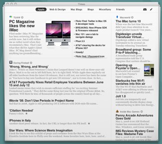
Times is completely inappropriate for skimming through large numbers of feeds, but it’s perfect for a small number of feeds where you want to focus on every headline. The program uses the metaphor of a newspaper, complete with different pages and sections within those pages. Two of the three sections can contain multiple feeds, and you can resize the sections to provide a couple variations on the basic three-section page. By default, when you click a headline, Times folds or slides down to reveal the full text (your choice; I chose slide as the less superfluous and quicker of the two). If the feed doesn’t contain full text, Times tries to fetch it from the webpage to display for you (extremely handy for major news sites that provide a couple sentences or less, although sure to give them headaches in the bandwidth department).

I didn’t expect to enjoy browsing through articles in Times, but I do. Not only does it provide an easy way to track just the feeds I want to read, but the attractive interface, ability to read full text without the distraction of the flashing ads normally littering the page, and just overall laid-back and friendly attitude of the program make using it a joy that offset my frustration with its various small bugs and shortcomings.

I didn’t really fall in love with the program, though, until I added a couple keyboard shortcuts using the System Preferences “Keyboard & Mouse” pane. Adding shortcuts to just two menu items made all the difference: “Mark All Articles as Read” received command-K and “Return to Page” (the command you have to trigger while reading the full-text version of the article) got the plain old left arrow. With these two commands, using Times became a relaxing one-hand maneuver: I use my right hand on my laptop’s trackpad to scroll through any sections on the page or click article headlines. Spacebar or two-finger scrolling takes me through the full text, and then it’s a short reach for my pinky to the left arrow to return to the page. When I’m done, command-K is again a very short reach away and all is right with the world.

What clinched the deal for me, really, was that the developer has been fixing bugs as fast as he can. Although he hasn’t been particularly responsive, he’s surely facing a mountain of feedback, and I’ve seen multiple bugs (and a small feature request) that I ran across and reported fixed within days. Plus the dude’s 19 years old and probably has homework or term papers to write. Given how polished Times looks (even with its usability shortcomings), I’ve got high hopes for its future. The newspaper metaphor is a great alternative to standard feed readers, and makes Times vastly different from the rest of the crowd. And if we’re lucky, Acrylic Apps will take the newspaper metaphor even further (I want to put the webcomics that I read on a single comics page in Times; who’s with me?) as they continue to refine and improve the program.

Despite my expectations and initial impressions, I’ve ended up a happy user of Times and NetNewsWire both, and I highly recommend Times for anyone who wants an elegant way to track a small number of feeds they care about. This is certainly not a program for everyone, but if its presentation of news makes sense to you, I doubt you’ll look back.

Web Snapper

Web SnapperWeb Snapper is a fantastic little utility (most recent update released today). Web Snapper does exactly one thing: it takes screenshots of websites. However, it does this one thing extremely well, with multiple export options (including vector PDF), the ability to catch Flash and DHTML in the act (if you use the Safari plugin), and more. I’d never heard of it before, but as coincidence would have it I discovered it the day after I had to go through a bunch of websites for my employer and take screenshots. This entailed a lot of work stitching them together and so forth that would have been completely unnecessary with Web Snapper (which would also have provided better quality screenshots). D’oh!

Although the $15 price tag will probably dissuade casual customers, if you ever need to take a screenshot of a number of websites, Web Snapper is a godsend. I highly recommend it. It’s a particularly powerful tool in the arsenal of the website designer who needs to showcase sites in their portfolio.

The Tasty Apps website is a fun experience in worthless DHTML, too (worth a visit just for that, really). Dragging the price tags is my favorite. I only wish they had dedicated pages for their various apps; the all-in-one thing doesn’t work for me at all.

MarioKart Wii

Although most people probably don’t need to be told, MarioKart Wii is out, and it’s loads of fun. The wheel takes a little getting used to (the first few races with it were brutally hard), but if you despise it you can always use the Wii remote + nunchuk or your old Gamecube controller.

I haven’t played all the races yet (two cups left to go!), but I highly recommend the game. Similar to the DS version (which rocked), MarioKart Wii offers 16 new races, and a full 16 races from selected past versions of the game (a mixture of DS all the way back to the SNES). Although the co-op goodness of Double Dash is no more, it’s still a great time with a friend, and also offers the ability to easily play online with up to 12 other people. Owning MarioKart is all but compulsory if you own a Nintendo system, so definitely give it a look. (And at the time of this writing, Wii Wheels on Amazon are only $10 as opposed to the normal $15, which is a bit more reasonable.)

Hogfather on DVD

Last week to my surprise and delight, I discovered that Hogfather was out on DVD. I hadn’t been aware that any of Terry Pratchett’s novels had been turned into films, and given the very positive reviews on Amazon and no easy way to rent it, I bought it. This, it turns out, was a mistake.

The Hogfather DVD is amazingly, phenomenally, mind-boggling bad.

Perhaps bad, even with all those adverbs, isn’t strong enough. Hogfather is horrible. Tedious. A crime against the book. Worse, it doesn’t even manage to be the good kind of bad (where the badness is in itself entertaining). I had to force myself to watch it all the way through, and I couldn’t do it in a single sitting.

At least some of my disgust with the movie comes from the fact that it’s not a movie. It’s a made-for-TV special. Perhaps if I’d been watching sitcoms and soap operas for a week or two and then watched Hogfather, it would be a lot more appealing. Unfortunately, as a rule I don’t watch TV. The closest I come is popping in my Arrested Development DVDs.

Despite my too-high expectations, though, it wasn’t low-budget special effects that ruined Hogfather. It was the fact that the movie completely failed to capture the book.

For anyone who has seen the DVD, this may seem an odd statement. The Hogfather DVD is very faithful to the book (the consistent comments in Amazon reviews to that effect were a big reason I bought it), which would normally make me overjoyed. I despise movies that abandon the books from whence they came (assuming it’s a book I’ve read and loved, that is). I practically can’t watch Howl’s Moving Castle. I loved Stardust, but was all but cursing as I walked out of the theater because of the Hollywood ending.

And yet Hogfather, which sticks fantastically close to the book, is nigh unwatchable.

I’d never thought about it before, but there are two things that a movie adaptation of a book needs: 1) the important details, and 2) the soul of the book.

Terry Pratchett’s work is exuberant, vivid, slapstick, witty, action-packed, and above all fun. The Hogfather DVD, although it got the witty dialogue right, completely missed out on the vivacious core that makes Terry Pratchett’s novels such great reads.

In any given scene in the Hogfather DVD, the actors stand around and talk. If they want to be threatening, they stand really close to each other and talk (“Ooh, I’m calling the personal bubble fairy!” *glingleglingleglingle*). Sometimes they do something while they’re talking, but not very often. Albert (Death’s helper) tries unsuccessfully throughout the movie to roll his own cigarettes. Not surprisingly, Albert is one of the best characters in the movie because he is capable of concentrating on two things at once.

I can only think of two times in my life when I have stood perfectly still (or close to) and talked to someone. Once was in debate class in eighth grade. The second time was during my brief stint as an actor in my final year of high school.

Why is it that mediocre actors think that conversation is about standing still? Human existence is, for the majority of people, about movement. We do things with our hands. If we’re feeling threatened or stressed our muscles tense up (and you can see that in every minor movement we make, even if we’re trying to stand still). Even if our mind is wholly engaged with a fascinatingly witty conversation, our body is up to something.

Terry Pratchett’s characters in the books are constantly moving. Even if there is an extended dialogue sequence, the reader still imagines the characters doing things, because Pratchett is a master at breathing life into spots of ink on a page.

What the Hogfather DVD spectacularly failed to do was capture this living movement. I’m not sure if it was bad acting or bad directing (I suspect both, with a bias towards directing), but the most exciting action in the show (apart from the badly animated CGI pigs) was people walking from place to place (and, in one memorable moment, walking from place to place while a building collapses around their heads; heaven forbid you should run to save yourself). Because the DVD is three hours long (two one and a half hour segments) you’re liable to fall asleep if you try to watch the whole thing in one go.

I could go on. There were innumerable other bad decisions that led to Hogfather being such a spectacular failure. The bizarre materializing beehive hairdo (which ruined the one attractive actor in the movie). The voice effects applied to the Auditors. The choice of Hogfather at all (while arguably the book with the best insight into the human existence, it’s far from Terry Pratchett’s best book and certainly not an easy one to translate to the screen). The fact that everything took twice as long as it needed to in order to fill the time.

There are some books where taking the time to present all the details works. The BBC six hour Pride and Prejudice special, for instance, is a good example (don’t ask how many times I’ve seen it; two younger sisters, ‘nough said). Of course, it had a better cast, as well, which can make all the difference.

Terry Pratchett’s novels deserve better treatment. Getting the dialogue and plot details right isn’t enough. Perhaps it isn’t even preferable. When a movie completely fails to capture the creative spark that’s animating the book, it doesn’t matter if it got every detail right; it’s still going to be a terrible adaptation.

I do not recommend Hogfather at all, even to die-hard Pratchett fans. People who haven’t read the book will be confused by the seemingly random rules of Discworld, while those who have will be forced to endure a lackluster attempt at capturing Discworld on film. Maybe someday a decent Terry Pratchett adaptation will arrive, but that day is not today.

A quick look at Voluminous

Voluminous, from developer Wooji Juice, is an interesting piece of software recently released for Mac OS 10.5. It has great things to say for itself:

The Internet is full of free books. But who has time to search for them? Let Voluminous bring the books to you. It finds, downloads and organises a vast library.

As best I can tell, this “vast library” is actually just Project Gutenberg (which is, admittedly, vast). In my opinion, this is a bit dishonest on Wooji Juice’s part (Project Gutenberg already has an easy search function, so the implication that Voluminous is doing loads of work the average citizen couldn’t by scouring a number of sources on the internet for books and consolidating them is suspect). It’s possible Voluminous is accessing more than just Project Gutenberg, but I haven’t seen any evidence of this; and that the help files and website don’t even mention Project Gutenberg smacks of dishonesty to me. I’d be a lot more impressed if the developers were upfront about what Voluminous is doing behind the scenes and played to its strengths: being more user-friendly and (this is a big one) not hideous. As it is, all the verbiage about saving you time is just marketing-speak shooting to take advantage of people who aren’t aware of the amazing resource that Project Gutenberg’s website represents. If all Voluminous is doing is downloading and parsing the GUTINDEX, shame on Wooji Juice.

Since the website was what I saw first, my first impression of the software was negative, but I downloaded it anyway for a closer look. I found that Wooji Juice may love the borderline marketing-speak, but they’ve still done some things extremely well:

Formatting the books. Project Gutenberg is a great project, but the actual book files are nothing you want to be reading because they are plain text and hideous. Voluminous’s greatest strength is that it makes the texts much more attractive. Sure, they aren’t like having a real book in your hands, but at least you don’t feel like clawing your eyes out while you try to read them. I would never consider downloading a book from Project Gutenberg to read (although I’ve used them for other things), but Voluminous helps make Gutenberg texts visually appealing and easier to read.

Attractive interface for searching and browsing. Voluminous has a great browsing interface. I love that while browsing, category headings (or authors, or whatever happens to be there) stick to the top of the screen, making it easy to keep track of what you’re looking at. Browsing by topic and the various searching capabilities are also very pleasant. This is a clear selling point of the software to my mind, because browsing and searching Project Gutenberg is not attractively designed at all (though entirely functional).

So at this point, despite the marketing-speak, Voluminous was looking pretty useful. Unfortunately, I then stumbled onto the program’s cons:

Text zoom is tied to window size. What the hell? I had thought there was no text zoom at all (bad enough), but then I tried to size the window down to get a more humane line length. I grabbed the resize dongle in the lower right corner, but the window wouldn’t move. Confused and alarmed, I dragged outwards, and as the window resized, the text zoomed in. This is a usability nightmare:

  • Not only is it impossible to control line length (which is an important part of making it easy to scan along the lines), but users who need or want a larger font will have to have a correspondingly larger window/monitor.
  • Two things that have no relationship to one another (the size of the window, and the size of the font) are now inextricably linked. Did I resize the window down because I wanted a smaller font? No, I resized it because I wanted to be able to cross-reference the book with a document next to it (or for any number of other reasons).
  • Standard Mac UI conventions are completely ignored. For me, the behavior of windows is sacred ground. I take for granted that I can close, minimize, and resize any window (with occasional minimum restraints on window size). Not being allowed to do so in Voluminous is inordinately frustrating, even if figuring out what is going on is easy. Damn it, I want a shorter line length!

The user has no control over what font is used. Although there are some good fonts in the nine provided themes, the user is given no way to select their own font (or, for that matter, design their own themes that I’m aware of). I ask you: what’s the point in reformatting plain text so nicely if you can’t modify even the font? Being unable to modify line height and so forth just adds insult to injury.

Full screen, of course, is also completely non-configurable and suffers from the same weaknesses as the main window. I was hoping for either a single column in the middle of the screen or, even better, multiple columns with horizontal scrolling a la Tofu.

In the end Voluminous is a great idea marred by the overall inability to configure the program in the one area where it matters (the display of text on screen). Not to mention an overabundance of marketing-speak that shifts focus away from its strengths and towards trivial aspects of the program that are easily available for free. I’ll definitely be keeping an eye on Voluminous, since I love the idea of a beautiful interface for Project Gutenberg (which might actually encourage me to make use of the resource), but at the moment I don’t think it’s really worth the £15/$30.

Wolfgang Puck Signature Soup

Wolfgang Puck says 'Have some tasty soup.'I never used to buy Wolfgang Puck canned soup because Wolfgang Puck’s face on the can is seriously creepy. I mean, the dude is worse than some of the Reader’s Digest covers that I had to turn over so I could use the damn bathroom as a kid. Aside from not being the best looking dude ever, he’s got a sort of predatory, “I vant to suck your blood!” look to his eye. Not something I need to see when I’m opening the cupboard craving sustenance.

But last week, Wolfgang Puck was the only canned soup on sale, and I live on canned soup on the weekends when my girlfriend is off at work. Thanks to my father, I hate to buy one brand when another brand is on sale, so I got a few cans to try out.

And damn, this stuff is good! Not only does it taste better than Campbell’s or Progresso, but the serving size is way better for a single person. I can pretty easily eat a whole can of Campbell’s soup on my own, but I always feel just a little too full. Wolfgang Puck’s is the perfect size.

So now I’ve got a cupboard full of Wolfgang Puck soup turned so his face is to the wall. If only they printed the name of the soup on the back of the can in big letters, I’d be set.

Dragon Bones and Dragon Blood

I just finished the best pair of fantasy books that I have read since I polished off Jonathan Stroud’s Bartimeus Trilogy or Megan Whalen Turner’s The King of Attolia. They were called Dragon Bones and Dragon Blood by Patricia Briggs, and I am astonished that a fantasy author of this caliber has escaped my notice for so long.

Fencing, fighting, torture, revenge, giants, monsters, chases, escapes, true love, miracles: from the classic list, the two books of the “Hurog duology” score an astonishing 10/10 (well, maybe 9/10; it isn’t fencing so much as swordplay). Add to that strong women characters (often sorely lacking in this Tolkien-inspired world), homosexual/bisexual relationships that are portrayed with the same depth of feeling as heterosexual relationships (although admittedly vilified slightly by the “young boys” predatory stereotype), and a world of realistic battles and fantastic heroics living side by side and you’ve got a winning formula if ever I’ve met one. I strongly recommend both Dragon Bones and Dragon Blood, and will be eagerly seeking out Patricia Briggs’ other novels.

Dragon Bones introduces us to a world of dragons long-dead, magic waning, and a problematic feudal system. After reading the blurb online and on the back cover, the story sounded pretty borderline, but Briggs successfully takes a plot that in other hands might have come across forced and hackneyed and deftly weaves it into a fascinating tale filled with memorably enjoyable characters. For whatever reason, I tend to enjoy children’s and young adult fantasy the most, and Dragon Bones successfully melds the pace and interest of young adult fantasy with some slightly more adult themes for an overall experience that should be appealing across a broad age span.

Dragon Blood is a bit darker than Dragon Bones (featuring, as it does, torture and political corruption), but every bit as good and leads the story in a more mature direction (appropriate, considering the aging of the characters). I found Dragon Bones more fun, while Dragon Blood was more gripping.

A big reason I enjoyed Dragon Bones and Blood is because Briggs successfully melds fantasy standbys in theme, plot, and setting with realistic-feeling world dynamics and characters. The heroics and magic are certainly larger than life, but they take place within the context of a world where violence is brutal and actions have consequences. It’s always a pleasant surprise for me to find an author who can write a complex fantasy world that utilizes fantasy tropes even as it moves beyond them, and Briggs does a good job of this.

Perhaps, though, the highest praise I can offer is this: when I laid down Dragon Blood, grinning like an idiot because I enjoyed it so much, the thought I came away with was “I want to write like this.”

Not only that, but she has a decent website, which is a pleasant change from some of my other favorite authors.